One of the most enviable and rare traits is the ability to consistently produce work that is unique and immediately recognisable as to who made it. If you think of the people who inspire you most in the spatial community, they all probably demonstrate this trait to some degree. Not many people can claim this, and many strive to achieve it.
Craig Taylor has this trait in abundance — his approach to spatial visualisation being both unique and incredibly beautiful. His body of work is growing by the day (I'm starting to think he never sleeps), and you've probably already seen it even if you didn't realise he was behind it. He firmly stands between the two realms of art and spatial data analysis, expertly taking complex spatial data and communicating it in a way that is both beautiful and insightful.
I've been a big fan of Craig and his work for a while now — he's had a huge impact on my own work and how I want to approach spatial visualisation — so it was a delight to finally meet him in person at an event at Ordnance Survey last year. It also turns out we have a lot in common, like both living in the arse-end of nowhere in the North West of the UK.
I recently had the pleasure of interviewing him for Spatial Awareness; learning about his journey with spatial visualisation, getting insight into his work and technique, and finding out just how he manages to consistently churn out so many amazing visualisations.
So please, grab yourself a panad (Welsh slang for a cup of tea), relax and enjoy this insight into the mind and technique of Craig Taylor. I'm certain you will find it as interesting as I have.
Do you have a burning question for Craig? Add a comment at the end of the interview. Also, let me know who else you'd like to see interviewed and I'll try and make it happen.
What did you think of the format of this interview? Would you like to see more free-form discussions in a podcast or video format? I'd love to hear your thoughts.
— Robin
First of all I'd like to thank you Craig for taking the time out to do this interview, I know these things take a lot of time and energy.
Can you begin by introducing yourself for anyone who isn't already aware of who you are?

Well I am the Data Viz Design Manager at Ito World and run our service sector which delivers bespoke 3D cinematic animations to clients. Generally these visualisations revolve around the use of transit data and are used by our clients to tell a story or derive some insight.
Outside of Ito World I run my Mapzilla website and spend too much of my free time finding new ways of visualising 3D data. Houdini has been a great outlet for me at the moment as it mirrors my node-based workflows I utilise in Ito World.
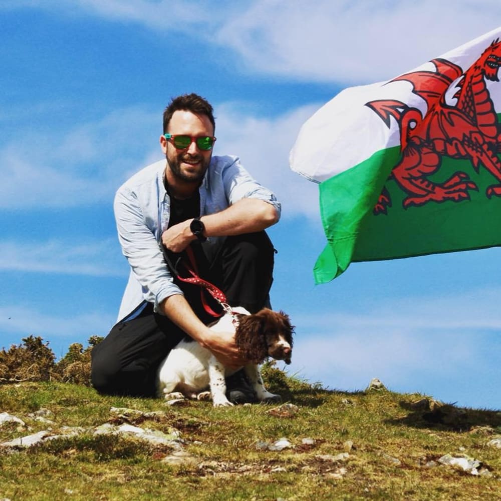
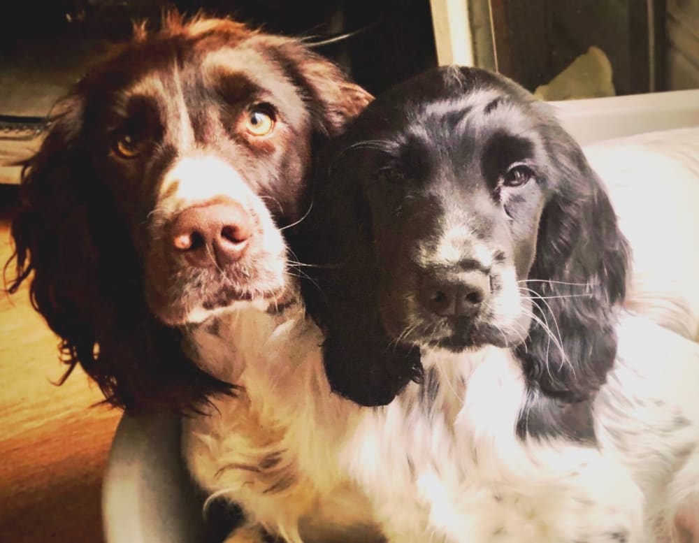
Oh and I have two wonderful spaniels Bryn and Toby who wanted a shoutout!

You can also follow Craig and his work through his Twitter and Instagram feeds.

I've always found it fascinating to hear the different journeys people go on to get where they are today.
How did you first get into spatial visualisation?
I have always been interested in the design side of cartography after being introduced to GIS through university however the emphasis here was on the spatial analytics, which was great, but design never seemed to be as important. It wasn’t until I started working with Landscape Architects that I appreciated how important design was.
Ever since that I have tried to position myself in roles that see spatial design as a must and not just a nice to have.
And what was your first job in the field?
GIS Technician with Mouchel Engineering in 2008, I was lucky to get a job in GIS right after my MSc in Environmental Informatics. It was a great role but a completely different ‘GIS’ to what University taught us. There was a lot of plan production, a lot of digitising and the inevitable ’CAD to GIS’ wrangling, which back in 2008 wasn’t a whole load of fun!
Master mapman GIS weirdo
So fast-forwarding to the present day. Where do you work now, and what do you do there?
DataViz Design Manager at Ito World for the past 3 years. Well according to my family in a recent quiz I'm an ‘illustrator of pointless flight and commuter data’ or ‘master mapman GIS weirdo.’ There is probably a bit of truth in both but I am in charge of delivering our 3D cinematic visualisations to a variety of clients. As I mentioned earlier usually these clients have transit data they want visualising in new or exciting ways.
Recently I have been working a lot with our internal archived data at Ito World whether that is finding new ways to visualise GTFS feeds or looking at visualising our prediction systems. I am lucky it’s such a creative role and also have access to an amazing toolset developed by our CTO Hal Bertram.
It’s the manipulation and animation of data to create something people might not have seen before that drives me to constantly seek new ways of visualising geo data
You mention that you've always been interested in the design side of cartography.
What are the driving factors in why you make maps? And what excites you about working with spatial visualisation?
I think everyone resonates with ‘place’ in one way or another and I find visualising geography fascinating but I love it when a ‘place’ comes to life through animation.
Take airport runways for instance, visualising the plane activity throughout a day is mesmerising and deriving the patterns and digital contrails the aircraft leave is something that you can’t appreciate until you see it animated. Or bus journeys and how the daily patterns of activity can create an urban heartbeat, or maybe turning drive-time catchments into coral formations.
It’s the manipulation and animation of this data to create something people might not have seen before that drives me to constantly seek out new ways of visualising geo data.
If you look back over your career so far, what would you say is your favourite piece of work? There's a lot to choose from!
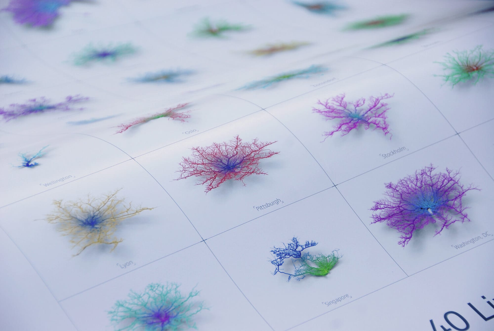
Coral Cities! It was the first major project which I thought could be classed as art, or at least close to art! I started looking at ways of manipulating drive-time catchments into 3D geometry and eventually came up with the Coral City concept.
From there the project grew and grew, we created small multiple posters and visualisations which got used on huge screens at the LA Autoshow! They were featured in fast company and even made it into Andy Kirks latest edition of Data Visualisation.
It’s the only project I’ve worked on where my wife asked for a custom poster to go in the house!
Your PlotMyPaws project is definitely one of my favourites, it's both visually compelling and also a fascinating insight into the crazy world of dogs.
Do you plan to revisit it?
I loved PlotMyPaws — it epitomised why I love working with spatial data but also the value in creating your own unique datasets. The insight that came from visualising where my dogs were running and eventually lots of other peoples dogs in my village was amazing and super interesting, even if I took the concept a bit far with 3D heatmaps and such the like!
I did begin a PlotMyPup sequel when our second puppy arrived, Toby, but I felt I was repeating a lot of what I did the first time round with a slightly bigger dog. I’d love to expand the project and get more people tracking their dogs, but it’s tricky unless people invest in trackers themselves.
Your work at Ito World is always inspirational. Tell me some more about your favourite projects there.
We recently delivered three data visualisations to TomTom for a number of cities showcasing their mobility products. They wanted to showcase how their data could be used to understand mobility within a city.
Each visualisation was split into three parts, a general heartbeat of traffic during the day, a comparison of traffic on a specific day with a public bank holiday and an insight into how congestion accumulates on a number of busy roads and intersections within a city.
It was fascinating how detailed their GPS traces are and they were happy for us to explore a few new visualisation styles including ‘congestion explosions’ which show traffic build up on key streets.
I wrote a blog on the evolving design we iterated through throughout the project.
We've seen so far that a lot of your visualisations are animated and 3D. What hardware and software do you use to create them?
All of our service work at Ito World is produced using our ‘Designer’ tool, it’s built on OpenGL and it optimised for fast rendering and designing on the fly meaning we can be really flexible when it comes to clients requirements.
Outside of Ito I am a huge fan of Cinema4D and the DEM Earth plugin and have dabbled in Blender during my early foray into 3D. As of late I am finding myself hooked on Houdini which feels as close to our Ito tool in terms of node based workflows as anything I have used. It’s incredibly powerful for animating 3D spatial data and is really fun to use.
Most of my projects are spatially orientated so I flip between QGIS and ArcMap depending on my mood!
Finally most projects are compiled and edited in After Effects and I am a huge fan of most of the Adobe Creative Suite really, back when I was making static maps Illustrator was my go-to-tool!
You also tend to focus on pre-rendered visualisations over realtime. Do you feel there are benefits of rendered output over realtime?
I suppose with rendered outputs you get the ability to hook into 3rd party renderers like Octane or Redshift etc. Octane has some great tools for rendering particles or hair on the fly without creating geometry so can be really beneficial when it comes to creating complex spatial scenes.
However looking at the work of Mike Brondbjerg or Marcin Ignac who utilise realtime rendering there are times I can’t tell the difference between WebGL and a 10 hour Octane render!
I am more interested in the abstract art end of the spectrum
Stepping back a moment to the design aspect of cartography. What are your thoughts on the debate around art vs. science in spatial visualisation?
All of our client visualisations at Ito World must try to tick at least three boxes, engagement, insight and narrative. So they have to look great but also tell an interesting story, with that in mind I’d say that my professional work straddles both these disciplines. Obviously we are fans of the cinematic high-end visual form of story telling but a lot of behind the scenes work that goes on is functional charts or schematic visualisations to understand the data we ingest.
With my personal projects I am more interested in the abstract art end of the spectrum, I like to manipulate data to create more interesting visualisations. Take the City Tendon project for instance, there is little insight to be gleaned from it, other than bus data has a weekly pulse, but it looks interesting and it’s based on real world data. All of my visuals are based on real-data but it’s not always apparently obvious what the data is, and that is what I like about it.
You've recently started creating spatial visualisations using Houdini. How have you found this? Do you have any advice for others thinking of doing the same?
I found Houdini very similar to our Ito software both being node based workflows, which I hadn’t experienced before joining Ito World. I love it and find it extremely powerful in terms of animating geospatial data.
I’ve started writing some tutorials on my website that people can follow along with! However it's not the most forgiving software to come to fresh, I’ve been using it for a few months now and haven’t even touched some of the tools in it.
There is also a slight price point as a barrier to entry, you can do a lot in the free version but if you want to render without a watermark and use 3rd party renders you need to upgrade to Indie, which is still a fraction of the cost of some software I’ve paid for in the past!
So what's next after Houdini? What technique or technology are you hoping to explore?
You are going to open my eyes to the world of real-time rendering Robin!
We recently delivered a big project based on deck.gl which was an interesting challenge! My speciality is in delivering animations which tell a user a specific story but I think delivering a client a tool where they can explore their own data is extremely powerful.
I also follow a lot of generative designers who use Processing so I would love to get to grips with that one day!
If it's not already clear to everyone reading this, you seem to consistently be working on and releasing new visualisations.
How do you keep up the momentum?
I feel I am in the lucky position that my day job is also my passion so a lot of the time offcut Ito projects turn into personal side projects.
I genuinely enjoy creating new ways of visualising 3D geo-data so don’t have a problem with momentum, there is always something being rendered! But at the same time I think it’s important to shut off every now and again, my best ideas have come when I am going for a run or in the garden.
If all we did was stick to the ‘tried and tested’ ways we would never evolve design
A lot of people discover your work through Twitter and Instagram, myself included, where you post a lot and have an engaged following.
What are your thoughts on the spatial community in those places?
Spatial twitter is great, there are lots of inspiring people creating some amazing content. Folk are really forthcoming with creating tutorials and techniques to share to the wider community, it’s what inspired me to create my Houdini tutorials.
I think with any community there are aspects which could be improved, recent conversations about ‘gatekeeping’ have shown that the vast majority of the community want to help rather than hinder. I think it is important for content creators to never feel worried about sharing work, if all we did was stick to the ‘tried and tested’ ways we would never evolve design.
I admire anyone who creates and shares in the community
Who do you look up to and admire in the spatial community?
In the spatial world specifically I think the way John Nelson and Topi Tjukanov contribute to the community as a whole is incredible. I love Owen Powel's work in Blender, the tone and atmosphere in his landscape compositions are wonderful.
422 South are also a big form of inspiration, their cinematic dataviz is second to none and it’s great seeing their work on documentaries.
Oh and what Jonni Walker does with Mapbox and cartographic design is very inspiring! On a broader note I admire anyone who creates and shares in the community, I love seeing all manner of cartography and data visualisation!
If you could pick one person in the spatial community for others to follow on Twitter, who would it be?
Robert Hodgin. I’ve only recently started following Robert after seeing his work with NYC taxis for Samsung. He is a fellow Houdini user and is creating some absolutely amazing visualisations including his latest River Meandering project which is absolutely mesmerizing.
It turns out we're both local to each other. What do you think about the spatial community in the North West of the UK?
I’m not too involved with the spatial community as a whole, I spoke at a Longitude event in Manchester last year which was great but other than that, as far as I am aware, the spatial community scene in the North West is lacking (Robin: Agreed!).
On a more positive note, what are you most excited about right now in the spatial scene?
Discovering a new tool like Houdini, for me, is exciting. Connectivity tools within it enabled me to create the City Tendon project I recently worked on. This was a new concept born from a new technique in a new tool, that's exciting because I know there are more techniques to be found.
Other than that it is really the data that goes into the visualisations that is exciting. For instance I’ve been recording and archiving European flight data via OpenSky Network since the beginning of lockdown, seeing the trends overtime is amazing! The drop in activity following country wide lockdown was incredibly impactful from a visualisation point of view and the gradual increase in activity in the months following will be great to see on a whole.
You never seem to be short of ideas. Where do you go to find inspiration for your future projects?
Twitter/Instagram/Pinterest — the usual sites.
Actually I get most inspiration from TV and film, the beginning intro to Westworld and all the chaos visualisations inspired me to do the City Tendril project. The intro from The Expanse on Amazon is also amazing — the fact it features some sort of mobility dataviz over NYC is great! Documentaries are also a big form of inspiration for me, some of the old lidar reconstructions on history docs are so cool!

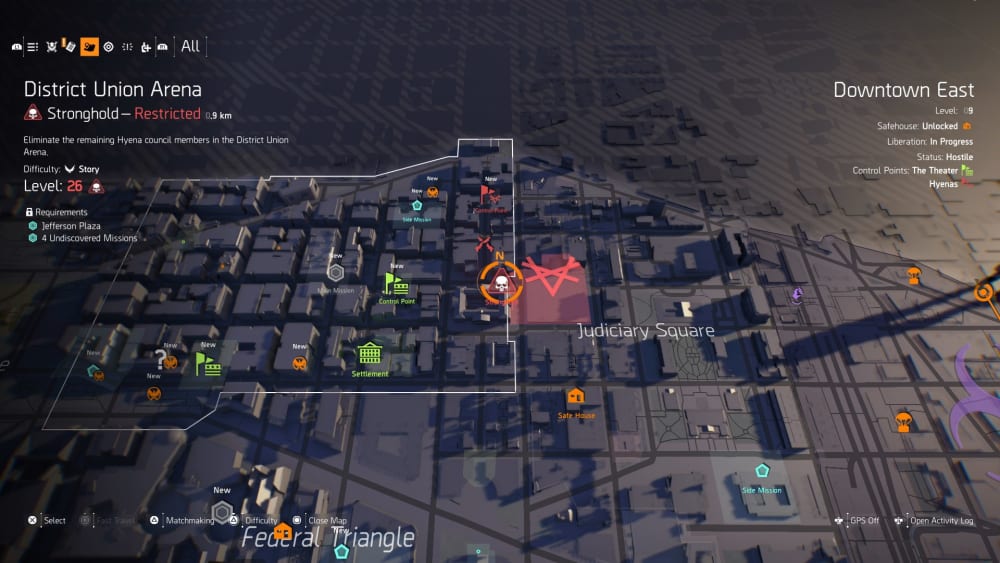
I also love gaming and take a lot of inspiration from maps and effects in games, The Division 2 map was one of the best I’ve seen!
I once got told not to make a map ‘that nice’ because then our clients would always want it like that
You've clearly had a very successful career so far, but what would you do differently if you got to start all over again?
I would definitely have made more of an effort to learn Python.
I would also have pursued my passion for 3D more intently during the start of my career and not been put off by some of the archaic gatekeeping and general confusion around GIS and its function during my earlier roles. I once got told not to make a map ‘that nice’ because then our clients would always want it like that — I didn’t stay there long!
Don’t be afraid of doing things differently
There are lots of fresh faces in the spatial community, and no doubt many more on the way.
What advice would you give to people who are just starting out?
Don’t be afraid of doing things differently. Cartography, like most disciplines, has its best practices, but I have most fun experimenting with visualising data in different ways.
Of course it’s completely dependent on the purpose of the visualisation and the audience its for, there is always an inherent sense of ‘responsibility’ involved with sharing data visualisations not to lie or obscure data... but there is always a time and a place for a TopoStix or PlotMyPaws visualisation as well!
What question would you like others in the spatial community to think about?
Is there an interest in exploring different tools for geo animation? We have seen the growth of Blender for mapping because of its BlenderGIS plugin, which is amazing, but do people have an interest in ‘animated’ visualisations and are their current tools fit for purpose in terms of creating animated visualisations?
I could talk about all this with you forever, but alas all good things must come to an end. I'd like to thank you again for taking the time to do this and giving us an insight into how you work — it's been fascinating.
Before we wrap up, is there anything else that you'd like to say?
Thanks for featuring my work Robin, and thank you all for the continued interest and engagement on my projects both for Ito World and my personal Mapzilla work.
I’m always looking for new ideas and data to explore and bring to life so if anyone has any suggestions or cool datasets that could be animated get in touch!


