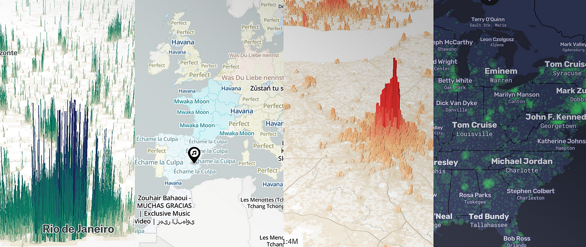
You may have seen those cool The Pudding visualisations doing the rounds. In this post Matt Daniels from The Pudding — who has the most job titles I think I’ve seen recently — breaks down how he and his team utilise a combination of Mapbox technologies to create those visualisations.
How The Pudding team uses Mapbox
As a member of the visual journalism team at The Pudding, I’ve spent the past year exploring how to integrate Mapbox into our editorial process. The Pudding is a digital publication that explains…
 maps for developers