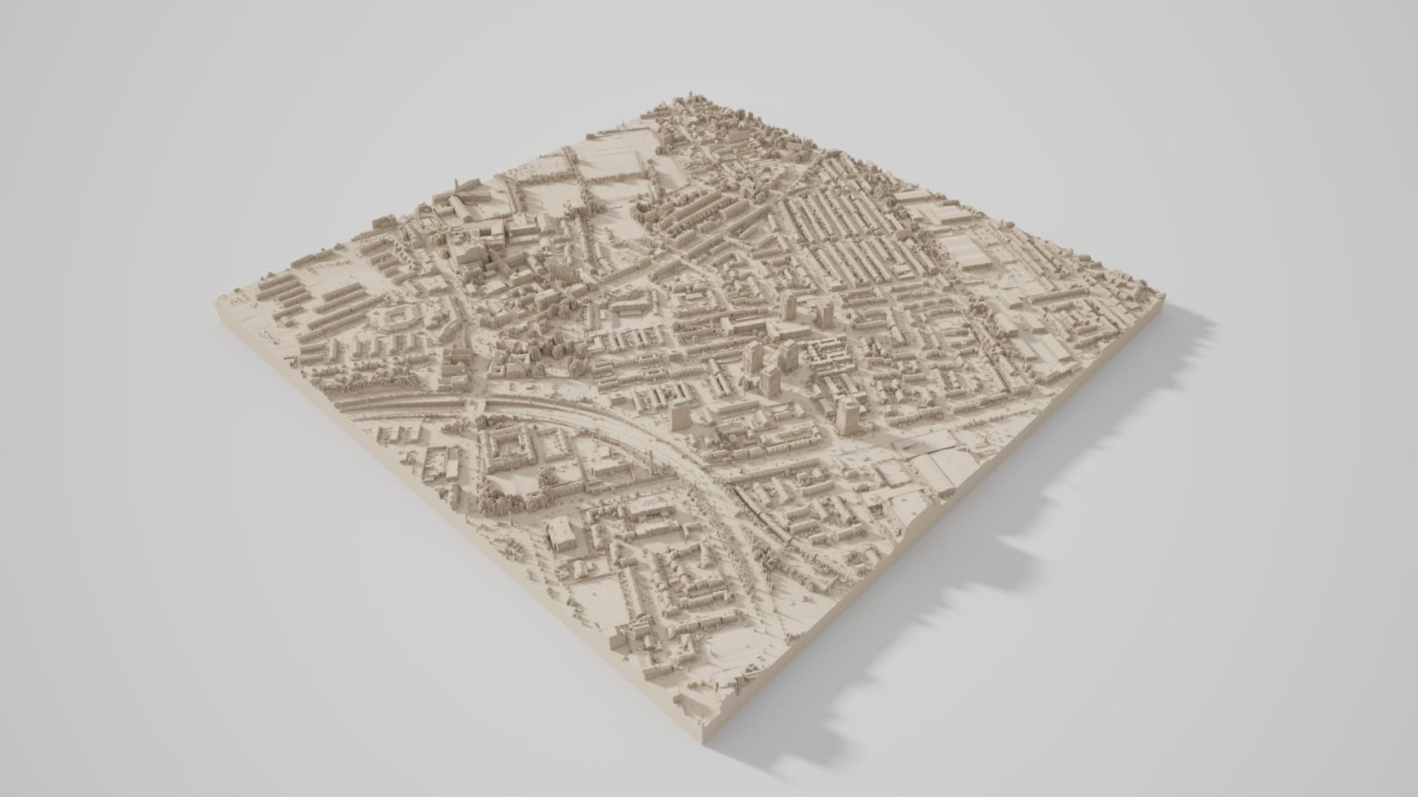
Community features Amazing 3D rendering with Aerialod Alasdair Rae has put together a guide on how to use the amazing Aerialod tool (covered in a previous issue) and his tips for getting the most out of it.
Community features How to make a beautiful map Who doesn’t want to make a beautiful map? Aside from a catchy title, this tutorial by Boris Müller goes into detail on how he and Fabian Ehmel created a
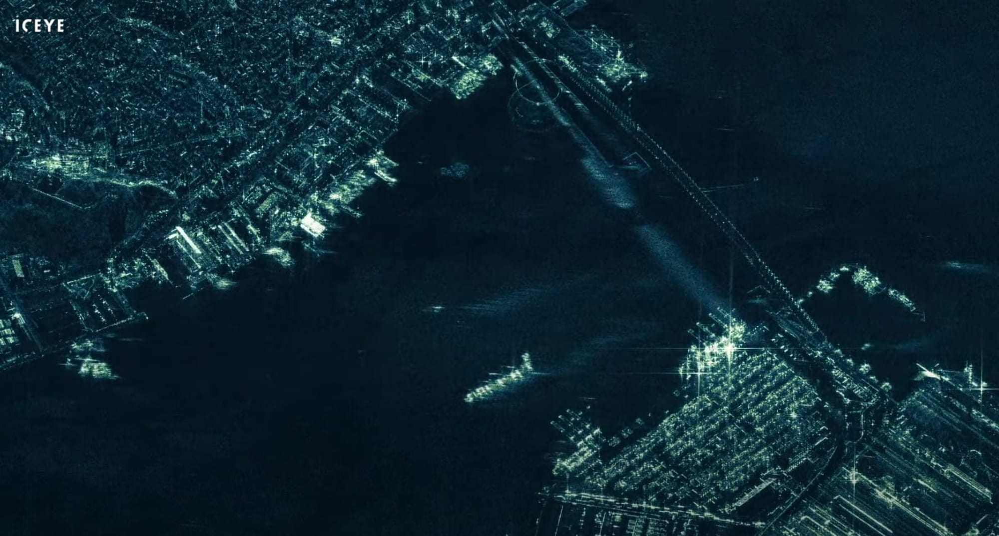
Community features Tron-like videos from SAR constellation If you’re not familiar with synthetic-aperture radar (SAR) then I’d highly recommend taking a look. It’s a fascinating area of remote sensing that’s being used in
Community features Behind the scenes of a Planet satellite launch Ever wondered what happens after a satellite is launched? I know I have. This post by Planet delves into the process they go through from first contact with their satellites all the way through to capturing their first image and integration within their wider
Community features Mapzen project updates Some news that put a smile on my face recently was seeing that the various Mapzen projects are still alive and kicking. They produced a large number of innovative projects in all areas of the spatial scene before Mapzen shut down; including tile-based routing,
Community features Guide to GeoTIFF compression and optimization with GDAL If you use GeoTIFF then you’ll be interested in this post from Koko Alberti. In it he takes a detailed look at the various approaches for compressing GeoTIFF and optimising it for lower file size and decent performance, including benchmarks on read/write
Community features Adjusting the range: How to scale data An old one but a good one! This relatively short post on the NASA Earth Observatory blog tackles the topic of scaling data in spatial visualisation. Specifically, it looks at the differences between linear and logarithmic methods for stretching the intermediate values and how
Community features The future of OpenStreetMap In this post, Sajjad Anwar from Development Seed takes a look at the future of OSM and how we’re going to get there. Key takeaways are more focus on verification, better utilisation of AI, and notification when the physical world changes and the
Community features How assuming the Earth is “flat” helps speed up rendering in deck.gl This in-depth article by Georgios Karnas takes a look at the issue of coordinate precision faced by Uber for Deck.gl, their 3D spatial visualisation library. Specifically, Georgios digs into the limitations of floating-point precision in WebGL shaders and details how they worked around
Community features Visualising Amsterdam’s heartbeat Craig Taylor strikes again with a series of beautiful animated visualisations for TomTom as part of his work at Ito World. The visualisations look at GPS data across the city of Amsterdam and how it can be used to tell a compelling story. The
Community features Drawing colour hillshade by hand It’s so easy to forget that digital isn’t the only way that spatial data can be produced and consumed. I’m guilty of this myself and it’s something I’m hoping to improve upon in the future, even if just printing
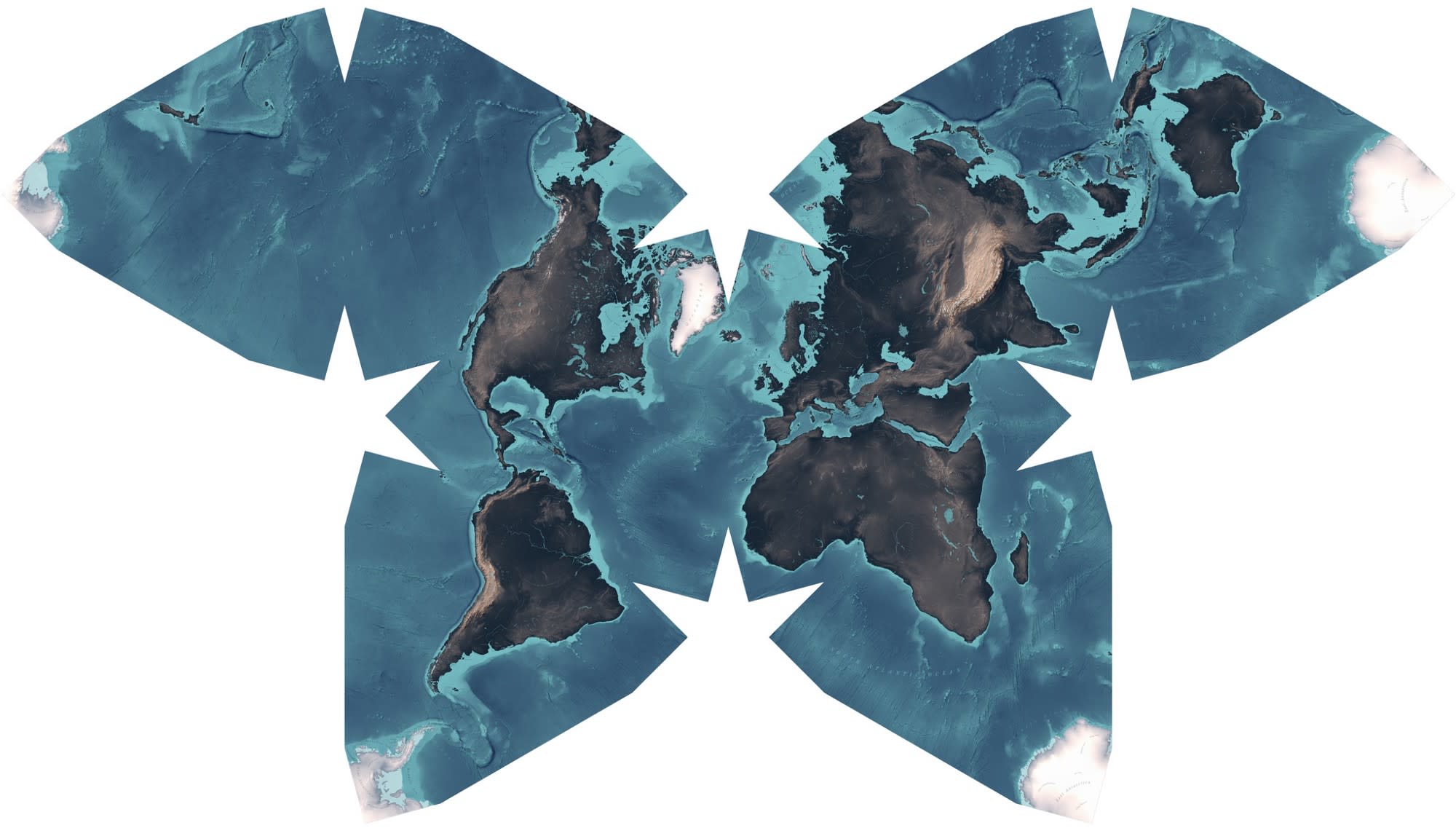
Community features Why all world maps are wrong This six-minute video from Vox takes a whimsical look at why flat maps are distorted and comparing that distortion between projections. It’s angled more towards people new to maps but its slick production value makes it interesting nonetheless.
Community features How Lyft creates hyper-accurate maps from real-time data Did you know that Lyft has an algorithm that detects errors and missing features in OpenStreetMap, fixes them, and then contributes them back to OSM? I certainly didn’t! This article details exactly how they achieve that and how they hope to contribute much
Community features Advanced label halos in QGIS 3 This tutorial by Tom Armitage details how to add a complex halo effect around labels using QGIS, combining blending modes and blur to enhance readability. His site is full of other QGIS tutorials and tips and is highly recommended. Advanced Label Halos in QGIS
Community features Creating shaded relief in Blender 2.8 Daniel Huffman has updated his fantastic and detailed tutorial on creating realistic shaded relief in Blender. Now with updated screenshots and generally re-worked to align with the latest Blender 2.8 release. Well worth checking out. Creating shaded relief in Blender 2.8
Community features Globe projections and insets in QGIS This tutorial by Alasdair Rae shows how to create an inset globe view in QGIS, or if you’re a “proper QGIS boffin” (his words!) — azimuthal orthographic projection. Whether you consider yourself a boffin or not, it’s a great tutorial and one I’
Community features Billions of birds migrate: Where do they go? Not only an interesting article, but the maps are beautiful too! I very much enjoyed this piece by National Geographic illustrating and detailing the migratory patterns of various birds. Billions of Birds Migrate. Where Do They Go?Migratory birds have made their thousand-mile flights
Community features Debanding the world It may be from 2014 but this article by Amit Kapadia is just as interesting today as it was back then. In it he talks about the process behind removing banding artefacts in Landsat 7 imagery caused by malfunctioning hardware on the satellite. Fascinating!
Community features Exploring geospatial data with kepler.gl I was engrossed reading this insightful post by Shan He on how Uber’s own data scientists use kepler.gl to visualise huge quantities of spatial data to discover patterns and pinpoint areas of improvement. The fact that the maps are so pretty is
Community features Interview with Craig Taylor on The MapScaping Podcast I highly recommend listening to this interview with Craig Taylor on The MapScaping Podcast. I found it really interesting getting insight into his experience and his approach to creating compelling and stunning spatial visualisations. He’s also one of the winners of the MonoCarto
Community features How PostgreSQL 12 can improve your performance There’s not long left to wait for the release of PostgreSQL 12 and — if my own experience is anything to go by — it brings with it a huge amount of new features and general improvements, particularly around performance. The great news is that
Community features NYT-style urban heat island maps I’ve always admired the maps created by news organisations such as The New York Times — there’s something about the balance between telling a story and keeping things simple yet beautiful. This tutorial by Katie Jolly details how to create maps in a
Community features Colouring LIDAR in Mapbox GL JS Mapbox GL JS has come on leaps and bounds in the past few years, especially when coupled with the enhanced 3D layers provided by Deck.gl and others. This tutorial by Allan Walker shows you how to make your own coloured 3D point cloud
Community features How a 16th century scientist drew a map of the world that we still use today This beautiful article by TASS is a love letter to Geradus Mercator and the fascinating history behind his famous work. It’s a long read, sprinkled with well-designed illustrations and interactive elements — definitely set aside some time to read and give it the attention
Community features 3 facts, 5 geo people Earlier this week I stumbled across the “3 facts, 5 geo people” conversation doing the rounds on Twitter. In it various people within the spatial community have been opening up and sharing some facts about themselves and advice for others. More stuff like this