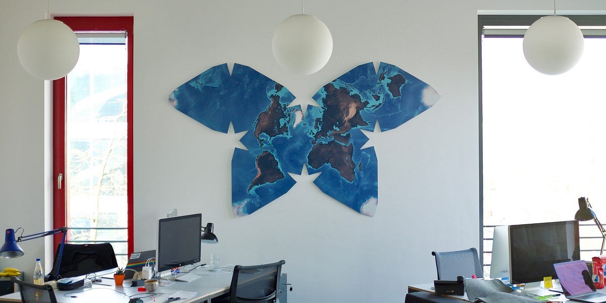
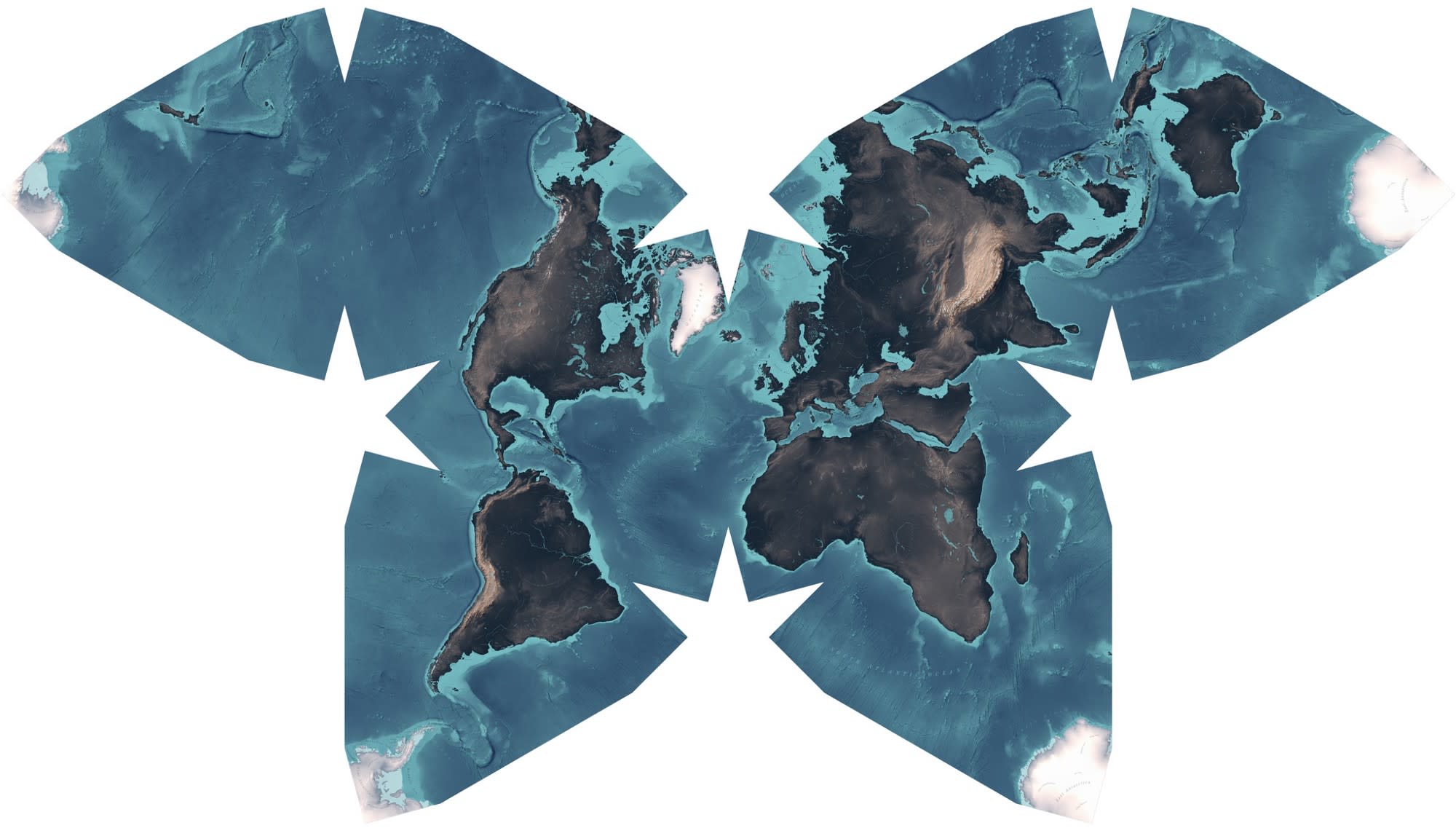
Who doesn’t want to make a beautiful map? Aside from a catchy title, this tutorial by Boris Müller goes into detail on how he and Fabian Ehmel created a lovely butterfly projection map. You’ll find out all the tools they used, the data, as well as the process to get to the final result you can see above.
Most of the detail is lost in the tiny image on this newsletter, I recommend having a read of the original post and looking at the high-resolution map as it’s really good.
How to Make a Beautiful Map
There is something weird and wonderful about analogue maps. They are increasingly useless yet incredibly beautiful. The obsessive level of detail of Ordnance Survey Maps, the typographic excellence…
 Medium